Statistical Lies I: Coronavirus
I’ve numbered this post, because this is obviously a well that will never run dry.
Let’s get right to it. First we have the easy ones (to make fun of): forecasting attempts. Ordinarily, a model has some sort of theoretical motivation (like the SIR model and its cousins). What could the theoretical inspiration possibly be for the now-infamous cubic fit?
Kevin Hassett is not an epidemiologist, of course. Let’s look at the work of someone a little bit more serious, like the once-renowned IHME. In March they presented a “statistical model” (i.e. a curve to fit to) for the cumulative number of deaths due to COVID-19.
First, some background. Gaussians appear in many statistical distributions, largely thanks to the central limit theorem. A good example is the number of photons received from a star. For a dim star, the number of photons received by a telescope in a short time scale is not Gaussianly distributed. For concreteness, let’s say that an average of one photon is seen by our telescope each second. Then, if we collect data for 100 seconds and plot a histogram, we’ll find that in most seconds, there were only zero, one, or two photons received. This is far from a Gaussian! But now, let’s collect data for 100 minutes. The average minute has 60 photons received, and in the histogram, we’ll see considerable weight in any bin from 50-70 counts. The distribution averages out to a good approximation of a Gaussian.
Any time you have several i.i.d random variables at play, you can expect the mean to be relatively well described by a Gaussian distribution. Thus it is often very reasonable to perform a fit to a Gaussian. This only works when there’s some sort of averaging process going on, though. The income distribution, for instance, is not even close to being a Gaussian (at least in the U.S.). And there’s no clear reason why the dates of COVID-19 deaths should be Gaussianly distributed (or even unimodal). Nevertheless, that’s exactly the model IHME proposed.
A more thorough review of the performance of the IHME model was posted on arxiv in April. The highlight of that paper is in the abstract: most of the time, the model did not correctly predict (to within the reported confidence interval) the number of deaths for the next day, thus failing the easiest possible sanity check for a forecast. Since then, IHME has changed their methods to not be obviously wrong.
(Not everything is equally terrible. See the COVID-19 forecast hub for a higher caliber of analysis, with comparison between different forecasts in order to build an honest picture of the uncertainty.)
Well, modeling and forecasting are clearly fraught with difficulty. Instead of building a proper model, let’s just look for correlations in the data. Perhaps some vegetables have a protective effect? This study looks country-by-country, to see if countries with higher consumption of certain vegetables have lower COVID-19 mortality rates. From the abstract:
[H]ead cabbage and cucumber reached statistical significance with the COVID-19 death rate per country.
The money plot is on the last page. Without the fit drawn, I’m pretty sure I would not draw the conclusion “cabbage has a protective effect”. This is a fit heavily dominated by two or three data points, in an environment where all data points should be viewed with some skepticism.
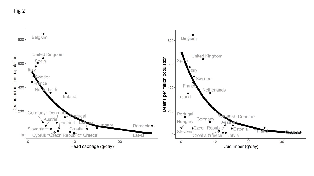
(Where did that curve come from, you ask? It’s right there in the abstract: “Mortality counts were analyzed with quasi-Poisson regression models…”.)
This is all horribly complicated! Let’s just “let the data speak for itself”. Are Sweden’s policies working?
I recall many similar-looking plots, on both sides, from a few months ago. The main difference is the chosen comparison cohort. Regardless of what you think of Sweden’s performance, you must agree: at least one of these two images is grossly deceptive. For broader context, here is a contemporaneous discussion of Sweden’s strategy with a more honest plot, revealing Sweden to in fact be pretty boring on a global scale.